

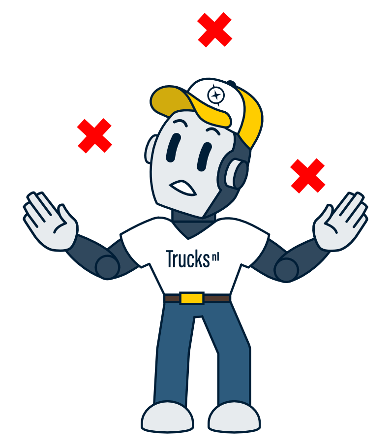
There are a number of common mistakes in ad titles that will cause you to miss out on buyers. Do you recognize yourself in (one of) the four mistakes below? Don’t worry. We’ll give you tips on what to do to write catchy ad titles. These are the ad titles your buyers will click on, guaranteed.
4 common mistakes in ad titles
1. Adding synonyms and translations
This reduces the scope for unique selling points. Many website systems automatically pay attention to synonyms and translate automatically. So there is no need to add translations and synonyms yourself.


2. Adding the category
When creating an ad, you always choose a category, so your ad will automatically appear in it. The space in your ad title is better used for unique selling points. In the examples above, the categories are ‘wheel loader’ and ‘sliding curtain’, so you can leave those out.
3. Using capital letters and exclamation marks
This comes across as garish and unprofessional. In addition, they both add nothing. Moreover, capital letters take up more space than ‘normal’ letters. So don’t capitalize whole words and don’t add exclamation points.

4. Listing duplicate information
Is a unique selling point for example a truck mounted crane already in the picture? Then don’t mention it in the title. You will save space for other unique selling points.
Tips for ad titles that buyers click on
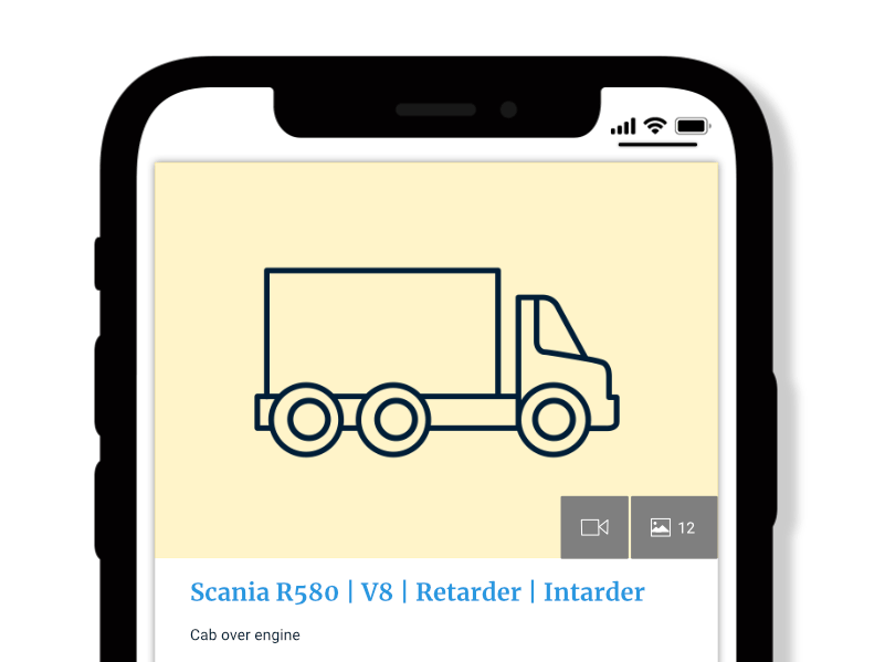
1 Readable on mobile phones
More than 60% of website visitors view TrucksNL on their mobile phone. So make sure your ad title is easy to read on a mobile phone. An ad title is shorter on a mobile than on a desktop. So take this into account.
An ad title on a mobile phone
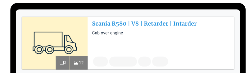
An ad title on a computer
2 Name unique selling points
Name about 3 unique selling points. This is because most buyers scan the ad titles. So keep them short, that way they are easy to scan on desktop and mobile phones.

3 Use separators
Separators allow your buyers to scan quickly. You can choose ‘standing’ dashes or commas. We don’t recommend hyphens. They cause confusion because hyphens can link words together when you don’t want them to.
In green you see the separators
